kalab
KALAB is a mobile app designed to serve as your companion, eyes, ears, and feet during museum and art gallery visits — whether you’re at home or on-site at a venue.
00

problem
With the global pandemic shutting down museums, galleries, and cultural venues, many people lost access to the experiences that connected them with art, culture, and community. For some, like mobility-impaired visitors, these barriers had existed long before the pandemic — with inaccessible physical venues limiting their participation in cultural life.
solution
Build a virtual platform that served as a hub for visiting multiple cultural venues during the pandemic, while also enriching the experience of in-person visitors once venues reopened. The platform needed to be useful in two modes: remote exploration from home, and an on-site guide that added depth to a physical visit.
The KALAB design process took place during April 2021 - December 2021, as part of the Google UX Design Professional Certificate program.
Understanding the User
Research Methodology
Five participants were interviewed remotely to uncover pain points and gather insights around museum visitation. Participants were selected based on a profile of regular museum-goers who incorporated cultural visits into their social lives.
Key interview questions included:
Have you ever used a museum app?
Did the pandemic affect your cultural activities? If so, how?
Could you describe a cultural experience that was significant for you?
Key Pain Points Discovered
1 | Loss of Cultural Discovery Users missed stumbling upon new cultural experiences — expositions, films, and community events — during lockdown. The serendipity of discovering something new was irreplaceable. |
2 | Physical Accessibility Barriers Mobility-impaired users faced a fundamentally different, often exclusionary experience due to physical limitations in gallery layouts. Wheelchair-inaccessible venues and crowded spaces created significant friction. |
3 | Social Connection vs. Art Engagement For many casual visitors, museum trips were primarily a social occasion rather than a deep artistic engagement. This distinction shaped how features needed to be designed and prioritized. |
User Personas
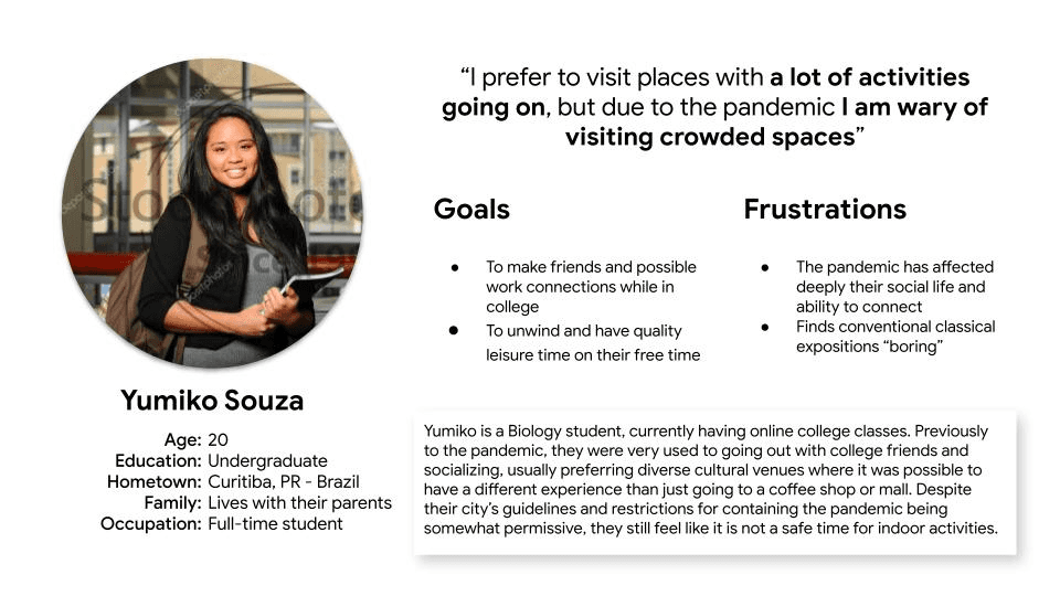
Persona 1: Yumiko Souza
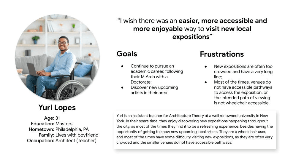
Persona 2: Yuri Lopes
User Journey Mapping
A journey map was built around Persona Yuri, tracking the experience of trying to see an exhibition without the hassle of a crowded, inaccessible space. The map traced five key stages:
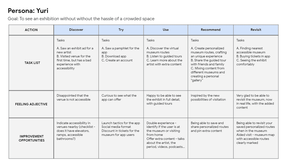
Key improvement opportunities identified across the journey: accessibility info upfront at the discovery phase, a double experience mode (virtual and in-person), personalized route creation, and accessible route overlays for physical museum visits.
The Design Process
Ideation: How Might We…
With the core problem defined, an ideation session explored a wide range of possible solutions to the challenge of replicating a physical museum visit digitally. Ideas ranged from practical (offering a free Google Cardboard VR viewer with a ticket purchase) to experimental (an online visitor “adopts” an in-person visitor who follows their commands like a game), with the eventual design settling on an app-led, personalized content experience combining virtual tours, AR views, and audio guides.
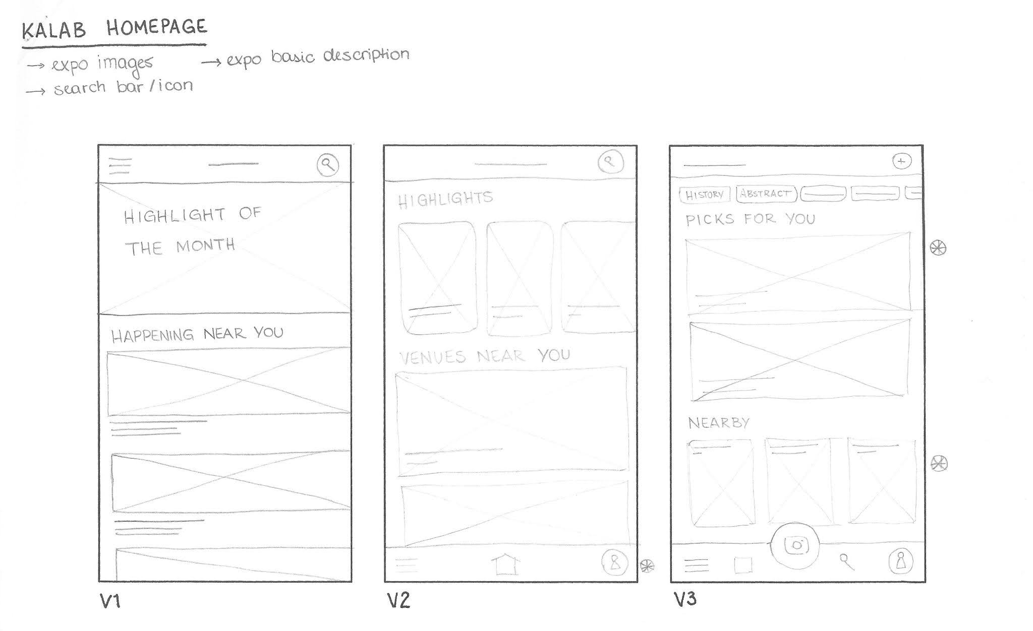
Paper Wireframes
Paper wireframe variations were sketched for the homepage alone before arriving at the refined version. Iterations explored different patterns for content layout, navigation placement, and content categorization — progressively narrowing toward a design that balanced discoverability with personalization.
Digital Wireframes
Based on competitive benchmarking, the digital wireframes were guided by four core design principles:
Light Features usable on any device | Local Highlighting nearby venues | Accessible Tool for inclusive visitation |
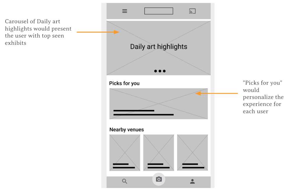
Key wireframe features included a carousel of daily art highlights (top-seen exhibits), a “Picks for You” personalized content section, and a “Nearby Venues” grid that surfaced geographically relevant content.
Usability Study
Study Parameters
Study Type | Unmoderated usability study |
Location | Brazil, remote — each participant completed the study on their own device |
Participants | Anyone with an interest in exhibits (visited at least two large-scale exhibits in the past 3 years) |
Session Length | 10–25 minutes, based on a list of prompts, followed by a System Usability Scale (SUS) questionnaire |
Findings
1 | Casting Feature Not Resonating Participants did not understand or find the “Cast to TV” functionality useful or common. The feature was removed or deprioritized in subsequent designs to reduce cognitive clutter. |
2 | Horizontal Scrolling Felt Unfamiliar Users were not accustomed to horizontal scrolling patterns. Participants specifically referenced TikTok and Instagram as reference points for expected behavior, leading to a shift toward vertical scrolling. |
3 | Favorites/Lists Feature Unclear One participant had difficulty understanding the “Lists” feature for saving content. The feature was redesigned to use more recognizable save/bookmark iconography consistent with mainstream app conventions. |
Refining the Design
Mockup Evolution
Usability study findings were directly applied in the high-fidelity mockup phase. Two key screens showed the most dramatic transformations:
Homepage: Before vs. After
The wireframe-era homepage relied on a generic card grid layout with horizontal scrolling. After the usability study, the home screen was redesigned around a full-bleed, immersive image carousel with clear tabbed navigation (Recommended / Discover). The visual hierarchy was dramatically simplified, leading with a singular featured artist rather than a cluttered grid of options.
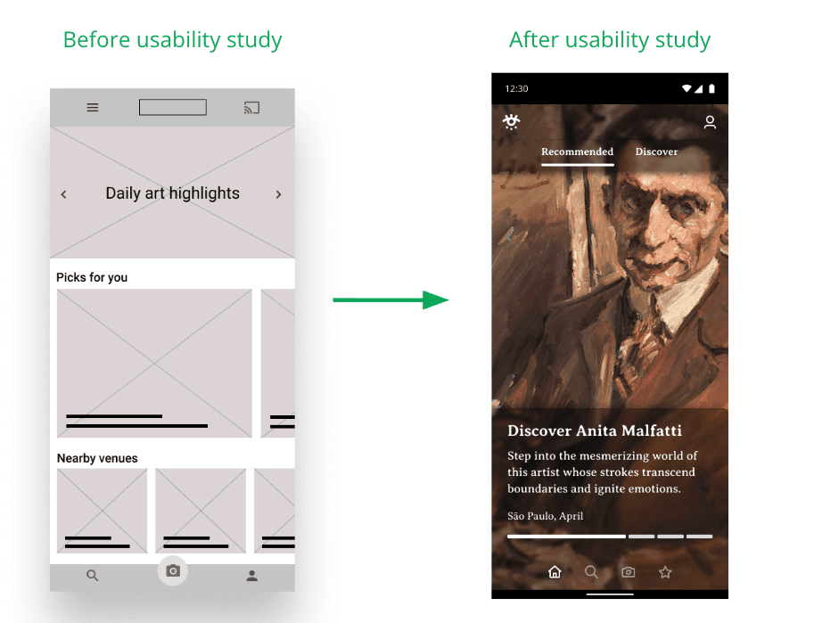
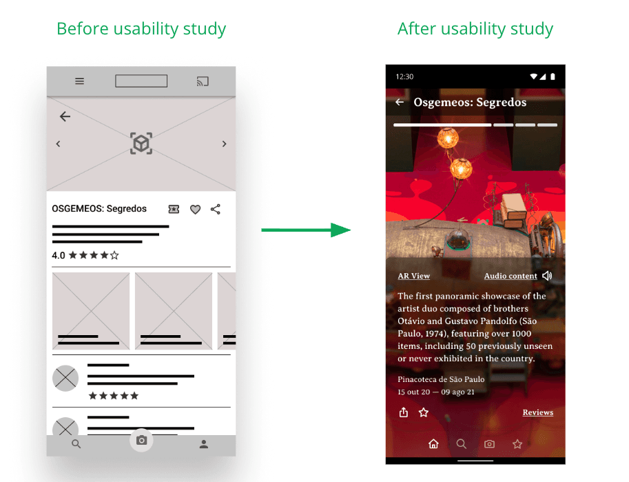
Exhibit Page: Before vs. After
The initial exhibit detail page included ratings, reviews, and multiple media thumbnails alongside the main content. Post-usability study, this was streamlined to focus the experience on the exhibit itself, with “AR View” and “Audio Content” as the primary interactive elements, and ancillary content like reviews surfaced through a clearly labeled link.
Accessibility Considerations
Accessibility was a core design pillar throughout the project, driven directly by Persona Yuri’s needs. Design decisions made in service of accessibility included:
High contrast color palette (teal on white, white on dark backgrounds) meeting readability standards
Audio content available for all exhibits, serving users with visual impairments or reading difficulties
AR View feature enabling virtual exploration of spaces that may be physically inaccessible
Accessible route overlays in the in-venue map feature, with clear markers for ramps, elevators, and accessible bathrooms
Outcomes & Reflection
What Was Delivered
The KALAB project delivered a complete, tested, high-fidelity mobile app prototype, including:
A personalized home feed with recommended and discover tabs
Full exhibit pages with AR View, Audio Content, and curated information
In-venue map functionality with accessibility route support
A “Saved” feature allowing users to build personal galleries from exhibits across multiple venues
Key Learnings
This project underscored several important lessons in UX practice:
Accessibility cannot be an afterthought — Yuri’s persona reshaped core architectural decisions, not just visual polish.
Users’ mental models are shaped by dominant apps like Instagram and TikTok — novel interaction patterns require stronger affordances or should be abandoned altogether.
Reducing cognitive load often means removing features, not adding them. Stripping back the homepage and exhibit pages led to a more focused, enjoyable experience.
Next Steps
If the project were to continue, the following areas would be prioritized:
Expand venue partnerships and test the platform with real museum partners in São Paulo
Conduct a second round of usability testing on the high-fidelity prototype with a broader, more diverse participant pool
Explore integration of a social layer (shared routes, collaborative playlists) to serve Yumiko’s use case more directly
Investigate the feasibility of the AR View feature with real museum floor plan data
year
2021
tools
Figma
category
Personal Project
01


